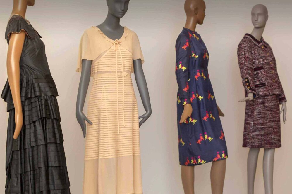
I’ve been an exhibition graphic designer for 12 years, but every show I work on brings new challenges and opportunities.
When I was lucky enough to work on Made It: The Women Who Revolutionized Fashion, I started my usual design process by asking: What does this collection say? What stories are these objects telling? And what emotions are we trying to convey?
Staring back at me in the title of the show was the ultimate inspiration for my central design idea — the women. This engaging exhibition is focused on women who overcame adversity and discrimination to put their art, their craft and their ideas into this world, forever changing how we view fashion and clothing.


One such powerful female figure was designer and seamstress Elizabeth Keckley, a biracial woman born into slavery who was able to save up $1,200 (equivalent of $33,000 today) to purchase her freedom in 1855, along with her son. Her extraordinary skills as a seamstress soon led her to open her own dressmaking business in Washington, D.C., becoming head seamstress and confidant to First Lady Mary Todd Lincoln. She later penned her own autobiographical narrative Behind the Scenes: Or, Thirty Years a Slave, and Four Years in the White House.

Immediately I felt a strong connection to Keckley because I’m also used to working behind the scenes. Being a biracial woman, I have felt marginalized in the 20th and 21st centuries and cannot imagine the struggles she faced living in the 19th century. The fact that she overcame the largest of prejudices to become one of the nation’s premier fashion designers in mid-1800s America is incredibly inspirational. I wanted to be sure the design of the graphics in the show would complement and not overpower the impact of her and the other designers.
I felt strongly that a woman should be the creator of whatever headline typeface we used for the show. But just like the world of fashion, the world of typography is also particularly dominated by men.
Why is this? It’s been suggested that due to women’s general lack of access to education throughout history, coupled with the demands of operating the labor-intensive printing press, positions were normally held by men. But this is just a theory. There are currently many women who are stepping up to try and bridge the gender gap in the world of typography.
I worked at a predominantly male-dominated design company for six years. When I started in this field at age 21, I was lucky enough to have two female mentors who were both incredibly talented (very patient) exhibition graphic designers. They took the time to teach me everything they knew and I’m forever grateful.
After looking through hundreds of different typefaces, I eventually came across Volte by Namrata Goyal, a designer in India. I immediately knew this was the one for Made It. Exuding the feeling of modern, current fashion and high-end design, the fonts still feel personal. I later learned that Goyal was a young, up-and-coming typeface designer, so it felt right to highlight her work.

Sometimes, when designing for a larger exhibition, a secondary typeface makes for a nice complement. Since Made It spans a range of 250 years, I wanted to mix an older typeface in with more modern Volte. I chose the classic Caslon, which was originally designed in the 16th century but was reimagined in 1988 by Carol Twombly while she was working for Adobe systems. Both Goyal and Twombly are examples of women pioneers in typography and their work together looks fantastic in the exhibition.

Choosing these typefaces emphasizes the collaborative nature of exhibition graphic design.
Any words found on a gallery wall is the work of multiple people. It may begin with the typographer who designed each letter of a word, but also reflects the exhaustive research of curators, the gentle hand of editors, the skills of photographers, 3-D designers and architects, and finally the printers and fabricators who create the finished piece.
No one person can take full credit of this process, and that’s what I love about this line of work. It’s how I imagine a fashionable ensemble being made — fabric, thread, buttons and sequins all from different places coming together to make something unique.

The author fabulously pulls off this rhinestone Zebra print face mask.
Many thanks to the Made It team and all of the amazing international teams that came together to create this historic exhibition in 2020, an unforgettable year of extraordinary challenges.
The author fabulously pulls off this rhinestone Zebra print face mask.
Keep exploring
Blog
Giving light
6 min read

Blog
The fine art of window dressing
6 min read

Blog
Women who made it
6 min read

Blog
The woman behind the brand
4 Min read

